Reading the Rotation Map
Imagine the stock market as an ocean, and institutional money as the currents. Capital is limited and never stays in one place - it flows from one sector to another. That flow is sector rotation.
Rotation Lab is the radar for those currents. It does not score individual stock charts in isolation. It shows how a sector (or holding) is performing relative to a benchmark, so you can see where big money is leaving and where it is quietly moving in.
This guide is adapted from a Trade Echo member write-up. Theory first, then the actionable playbook, then a worked example. Not financial advice - use it as a read framework, not a signal service.
Open the tool: app.tradeecho.com/rotation-lab.
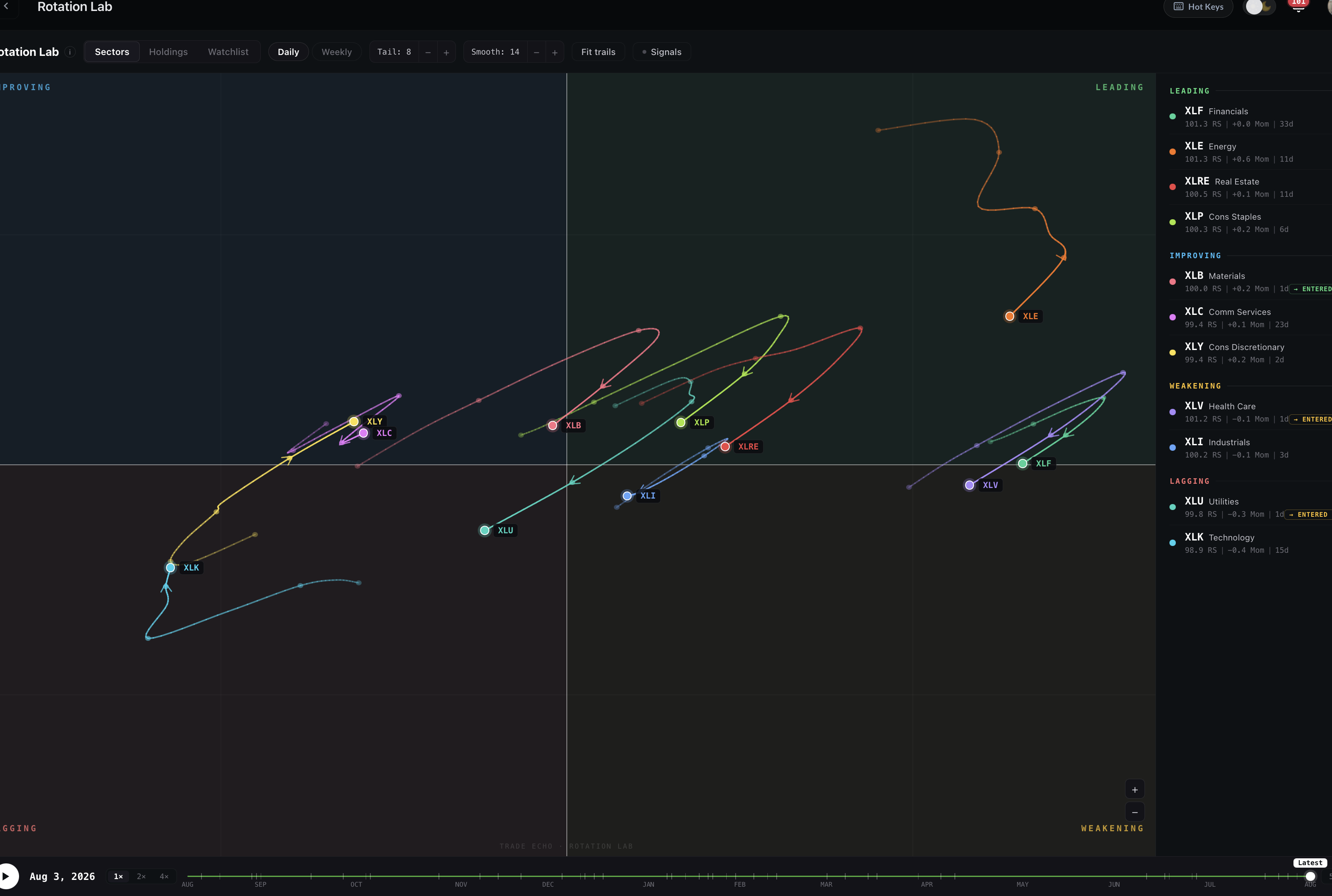
Part 1: Two axes
Do not let the trails intimidate you. The whole map is built on two questions:
| Axis | Trade Echo label | Question it answers |
|---|---|---|
| X (horizontal) | Relative strength (RS-Ratio) | Are you stronger or weaker than the benchmark? |
| Y (vertical) | Relative momentum (RS-Momentum) | Is that relative strength speeding up or slowing down? |
How to read the centerlines (in Trade Echo the plot centers at RS-Ratio = 100, RS-Momentum = 0):
- Right of center - winners on a relative basis. The name is outperforming the benchmark (usually SPY in Sectors mode).
- Left of center - losers on a relative basis. Underperforming the benchmark.
- Above center - stepping on the gas. Relative strength is accelerating.
- Below center - hitting the brakes. Relative strength is decelerating.
Important: this is relative, not absolute. A sector can rise in price and still sit on the left if SPY is rising faster. RRG answers "where should capital prefer this group versus the alternative," not "is the chart green today."
Part 2: Four quadrants (four seasons)
The two axes create four quadrants. A useful mental model is seasons. Names typically rotate clockwise: Improving → Leading → Weakening → Lagging → back to Improving.
| Quadrant | Season | Location | Meaning | Bias |
|---|---|---|---|---|
| Lagging | Winter | Bottom left | Money is fleeing. Relative strength and momentum are both soft. | Avoid fresh longs unless you are hunting shorts or deep mean-reversion |
| Improving | Spring | Top left | Bottoming process. Still underperforming, but momentum has turned up - early capital often shows up here. | Best hunt zone for early long setups |
| Leading | Summer | Top right | Outperforming and still gaining. Crowd loves it; trend-followers ride it. | Great for riding strength; far top-right can be overextended |
| Weakening | Fall | Bottom right | Still outperforming, but momentum is rolling over. Profit-taking and rotation-out often start here. | Scale out / tighten risk; do not blindly chase |
Clockwise is the idealized path. Real markets also print hooks, stalls, and short reverse loops. Trust the tail direction more than the quadrant label alone.
Winter = Lagging (BL) · Spring = Improving (TL) · Summer = Leading (TR) · Fall = Weakening (BR). If someone says "Fall" they mean Weakening (bottom right), not top left.
Part 3: Arrows, tails, and spacing
Each symbol is a head (today) with a tail (recent path). The tip is now; the trail is history. The heading shows where relative momentum is pushing the name next.
Direction predicts the next step
If a sector sits in Improving and the arrow hooks sharply toward the top-right (into Leading), that is a classic "rotation into leadership" tell - still confirmation, not a market order by itself.
Spacing measures speed
Dots along the trail show pace:
- Dots far apart (long stretch) - accelerating. Money is rushing in or out aggressively.
- Dots clustered (knots / short steps) - consolidating or stalling. Wait for a cleaner heading.
In Rotation Lab, use Tail length and Smooth to control how much history and how reactive the path looks. 1H / 4H catch intraday rotation; Daily is tactical; Weekly is the bigger regime.
The golden hook
The highest-value early long pattern: a tail near the Lagging / Improving border that paints a clean U-turn (or hook) up and to the right - toward Leading. That is "spring" showing up on the radar.
Part 4: Actionable playbook
A four-step workflow that stays inside Trade Echo:
Step 1 - Macro on Sectors mode
Open Rotation Lab → Sectors (benchmark VS SPY). Lock eyes on Improving (top left). Prefer names that have just bottomed with arrows hooking up and right. Getting the sector direction right is half the battle.
Step 2 - Drill Holdings
Click into that sector's Holdings. Same RRG logic, now vs the sector ETF. Filter for the stocks moving fastest with the sharpest upward trajectories. If you buy the group, prefer the leader of the group, not the laggard inside it.
Step 3 - Confirm with OptionFlow
Open OptionFlow on the ticker. If the rotation map says "capital is rotating in" and large call (or bullish) flow agrees on strike and expiry, you have confluence. Flow can also frame target and time window - treat it as context, not gospel.
Step 4 - Chart entry
Never buy the map alone. Pull the price chart (and optionally Dealer Edge / Darkpool) for a technical entry, invalidation, and size.
Optional fifth check: Weakening names you already own - use the map as a reminder to secure profits on strength, not as an automatic market sell.
Worked example: XLP → PEP (member case)
Member narrative from mid-July (illustrative - always re-check the live map). Screenshots below are from that case study, not live market state.
- Starter on the sector hook - On the Sectors map, XLP (Consumer Staples) had spent time pointing toward Lagging (Winter / bottom left), then showed a sharp reverse. The head stopped in Improving (Spring / top left). That is left-side / early rotation - higher risk - so starter size only made sense.
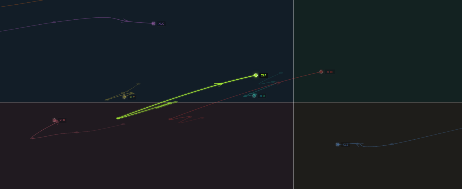
- Add when heading clarifies - Days later the arrow moved toward the top-right at roughly a 45° angle, still in Improving but closing in on the Leading border. That is the "spring turning into summer" tell for the sector.
- Pick the holding + flow - Inside the group, PEP showed constructive OptionFlow while the sector thesis held.

- Follow-through - XLP eventually pressed into leadership on the map; the edge was identifying the Improving hook before the crowded Leading print.
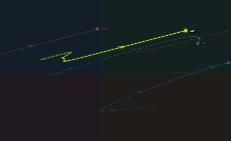
Takeaways from the example:
- Improving with a clean hook ≠ guaranteed winner - size for uncertainty.
- Sector first, stock second, flow third, chart last.
- Playback in Rotation Lab is useful for studying the same path after the fact.
How to write your own weekly read
Do not treat anyone's dated "current map" notes as standing orders - the map changes. Use this checklist instead:
| Bucket | What to ask |
|---|---|
| Secure / trim | Names deep in Weakening with tails still pointing toward Lagging - one more pump may be distribution |
| Accumulate on dips | Names leaving Lagging / Improving with tails toward Leading - build only if chart + flow agree |
| Sidelines | Volatile shakeouts in Improving/Weakening with knotted tails - wait for heading + breakout |
| No chase | Crowded Leading far from center with momentum already rolling - consolidation or pullback risk |
Pair the weekly map read with Snapshot for breadth/sentiment and OptionFlow for ticker-level confirmation.
Common mistakes
- Buying deep Leading because "it looks strong" - much of the relative move is already priced; prefer Improving hooks.
- Mixing up Fall and Spring - Fall is Weakening (bottom right); Spring is Improving (top left).
- Ignoring Holdings breadth - a sector can sit in Leading on two mega-caps. Drill before you buy the ETF story.
- Treating RRG as direction of price - it is relative to the benchmark. Confirm absolute trend on the chart.
- Skipping confluence - map + flow + chart beats map alone.
Next steps
- Rotation Lab - product controls: universes, tails, live drift, playback, signals
- OptionFlow Quick Start - flow confirmation on the chosen ticker
- Three-Tool Confirmation - stack more Trade Echo tools before size
- Daily Trading System - where rotation fits in a session routine